The Challenge
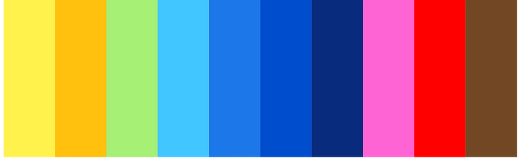
Kribi an established coffee shop with an existing typographic logo utilizing a bright color palette rooted in African tribal colors. The challenge was to integrate new coffee bag designs, take out coffee cups/labels and a new bag design.
The Outcome
Creating proposed graphic packaging as a storytelling medium that viaually encapsulates the essence of the brand and its products. Communicating Kribi’s values and personality, the uniqueness that sets it apart from competitors.
Kribi Coffee’s mission is about building a local community that values hard work, innovation and fair trade. Redesigning three blended coffee bags, Happy Face, Love is Love, and Mt Oku. I chose the water buffalo for the Happy Face coffee bag to represent the feel good quality of the coffee. The water buffalo is a symbol of strength, tenacity with a powerful presence. The heart, love, to emphasize that all forms of love are valid and to be treated equally. Mt Oku is the largest volcano in Cameroon, it too has a powerful pesence as a symbol of strength, tenacity and resilience.
Kribi Coffee Identification Elements
Typefaces & Typography
There are two official typefaces for all materials produced by Kribi Coffee. The primary typeface is Franklin Gothic ATF. The secondary typeface is Anzo Sans Uber.